Releases: macCesar/purgeTSS
v3.1.7
What's new in v3.1.7
Changed fonts.js module name
We've changed the name of purgetss-fonts.js to purgetss.fonts.js to match the naming convention with the animation module purgetss.ui.js
Better handling of project names on Windows
Now on Windows you can create a project with spaces in its name without getting an error using purgetss create "My New Project"
New message when building from an empty fonts folder.
If you run purgetss build-fonts with NO font or css files in ./purgetss/fonts, you will get the following message:
Add fonts and css files to
./purgetss/fontsand run this command again!
v3.1.5
What's new in v.3.1.5
build-fonts command
With the new build-fonts command in PurgeTSS, you can create a fonts.tss file with all the class definitions and fontFamily selectors from any Serif, Sans-Serif, Cursive, Fantasy or Monospace font families.
Just put all the .ttf or .otf files that you want to use in ./purgetss/fonts/, and run the command
> purgetss build-fonts

# alias:
> purgetss bf- It will create the
./purgetss/fonts.tssfile with all class definitions andfontFamilyselectors - It will copy the font files into
./app/assets/fontsfolder - If necessary, PurgeTSS will rename the font files to their corresponding PostScript Name
In this example we are using the Bevan and Dancing Script fonts from Google Fonts.
# Root of the project
purgetss
└─ fonts
   ├─ Bevan-Italic.ttf
   ├─ Bevan-Regular.ttf
   ├─ DancingScript-Bold.ttf
   ├─ DancingScript-Medium.ttf
   ├─ DancingScript-Regular.ttf
   └─ DancingScript-SemiBold.ttf
// Fonts TSS file generated with PurgeTSS
// https://github.com/macCesar/purgeTSS
'.bevan-italic': { font: { fontFamily: 'Bevan-Italic' } }
'.bevan-regular': { font: { fontFamily: 'Bevan-Regular' } }
'.dancingscript-bold': { font: { fontFamily: 'DancingScript-Bold' } }
'.dancingscript-medium': { font: { fontFamily: 'DancingScript-Medium' } }
'.dancingscript-regular': { font: { fontFamily: 'DancingScript-Regular' } }
'.dancingscript-semibold': { font: { fontFamily: 'DancingScript-SemiBold' } }Now you can use any of those fonts in your project.
Organizing the fonts folder
For better organization, you can group each font family in sub-folders, for example:
# Root of the project
purgetss
└─ fonts
   └─ bevan
      ├─ Bevan-Italic.ttf
      ├─ Bevan-Regular.ttf
   └─ dancing-script
      ├─ DancingScript-Bold.ttf
      ├─ DancingScript-Medium.ttf
      ├─ DancingScript-Regular.ttf
      └─ DancingScript-SemiBold.ttf
You will get the same fonts.tss file as the previous example, but with a much better organized fonts folder.
Icon Font Libraries
You can add any icon font library that has either a .ttf or .otf font file and a .css file with unicode characters.
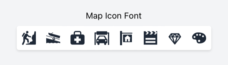
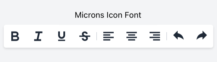
In this example we are using the map-icons and the microns icon font libraries.
# Root of the project
purgetss
└─ fonts
   └─ bevan
   └─ dancing-script
   └─ mapicons
      ├─ map-icons.css
      └─ map-icons.ttf
   └─ microns
      ├─ microns.css
      └─ microns.ttf
After running purgetss build-fonts you will have all the unicode characters in fonts.tss.
// Fonts TSS file generated with PurgeTSS
// https://github.com/macCesar/purgeTSS

'.map-icons': { font: { fontFamily: 'map-icons' } }
'.microns': { font: { fontFamily: 'microns' } }

// Unicode characters
// To use your Icon Fonts in Buttons AND Labels each class sets 'text' and 'title' properties
// map-icons.css
'.map-icon-abseiling': { text: '\ue800', title: '\ue800' }
'.map-icon-accounting': { text: '\ue801', title: '\ue801' }
'.map-icon-airport': { text: '\ue802', title: '\ue802' }
'.map-icon-amusement-park': { text: '\ue803', title: '\ue803' }
'.map-icon-aquarium': { text: '\ue804', title: '\ue804' }
// ...

// microns.css
'.mu-arrow-left': { text: '\ue700', title: '\ue700' }
'.mu-arrow-right': { text: '\ue701', title: '\ue701' }
'.mu-arrow-up': { text: '\ue702', title: '\ue702' }
'.mu-arrow-down': { text: '\ue703', title: '\ue703' }
'.mu-left': { text: '\ue704', title: '\ue704' }
// ...
CommonJS module
You can use the --modules flag to generate a CommonJS module called purgetss-fonts.js in ./app/lib/.
To avoid any conflicts with other icon libraries that you may use, PurgeTSS will keep each icon prefix.
> purgetss build-fonts --modules

# alias:
> purgetss bf -m
const icons = {
// foundation-icons.css
'.fiAddressBook': '\uf100',
'.fiAlert': '\uf101',
'.fiAlignCenter': '\uf102',
'.fiAlignJustify': '\uf103',
'.fiAlignLeft': '\uf104',
// ...
// map-icons.css
'.mapIconAbseiling': '\ue800',
'.mapIconAccounting': '\ue801',
'.mapIconAirport': '\ue802',
'.mapIconAmusementPark': '\ue803',
'.mapIconAquarium': '\ue804',
// ...
};
exports.icons = icons;Font Awesome v.6.0.0
The fontawesome.tss file has been updated to include Font Awesome v.6.0.0.
We've also updated the scripts to generate your Pro or Beta version of fontawesome.tss file.
Fixed package.json when using the --tailwind option in purgetss create.
When creating a new project with purgetss create 'name of the project' --tailwind, the package.json file was throwing an error if the name of the project contain spaces.
Animation Module
Animate the complete attributes.
The animation module will execute the properties defined with the complete attribute.
In this example the open animation will reduced the children of the letters view to a size of 1%, after completion, the complete attributes will be executed: Setting the background color to green and the scaling back to 100%.
<Alloy>
  <Window title="App Wordle" class="bg-(#181e2d)">
    <View class="vertical">
      <View id="letters" class="horizontal">
        <Label class="w-8 h-8 mx-1 text-center text-white bg-transparent border-white rounded" text="T" />
        <Label class="w-8 h-8 mx-1 text-center text-white bg-transparent border-white rounded" text="I" />
        <Label class="w-8 h-8 mx-1 text-center text-white bg-transparent border-white rounded" text="T" />
        <Label class="w-8 h-8 mx-1 text-center text-white bg-transparent border-white rounded" text="A" />
        <Label class="w-8 h-8 mx-1 text-center text-white bg-transparent border-white rounded" text="N" />
        <Label class="w-8 h-8 mx-1 text-center text-white bg-transparent border-white rounded" text="I" />
        <Label class="w-8 h-8 mx-1 text-center text-white bg-transparent border-white rounded" text="U" />
        <Label class="w-8 h-8 mx-1 text-center text-white bg-transparent border-white rounded" text="M" />
      </View>

      <Button class="mt-4" android:onClick="doAnimate" ios:onSingletap="doAnimate">Animate</Button>
      <Button android:onClick="doReset" ios:onSingletap="doReset">Reset</Button>
    </View>

    <Animation module="purgetss.ui" id="myAnimationReset" class="bg-transparent" />
    <Animation module="purgetss.ui" id="myAnimationOpen" class="open:scale-1 complete:bg-(#008800) complete:scale-100" />
  </Window>
</Alloy>$.index.open();
function doAnimate() {
$.myAnimationOpen.play($.letters.children);
}
function doReset() {
$.myAnimationReset.apply($.letters.children);
}Extra delay and duration values
Added extra delay and duration values.
// Component(s): Ti.UI.Animation
// Property(ies): delay
'.delay-0': { delay: 0 }
'.delay-25': { delay: 25 }
'.delay-50': { delay: 50 }
'.delay-75': { delay: 75 }
'.delay-100': { delay: 100 }
'.delay-150': { delay: 150 }
'.delay-200': { delay: 200 }
'.delay-250': { delay: 250 }
'.delay-300': { delay: 300 }
'.delay-350': { delay: 350 }
'.delay-400': { delay: 400 }
'.delay-450': { delay: 450 }
'.delay-500': { delay: 500 }
'.delay-600': { delay: 600 }
'.delay-700': { delay: 700 }
'.delay-800': { delay: 800 }
'.delay-900': { delay: 900 }
'.delay-1000': { delay: 1000 }
'.delay-2000': { delay: 2000 }
'.delay-3000': { delay: 3000 }
'.delay-4000': { delay: 4000 }
'.delay-5000': { delay: 5000 }

// Component(s): Ti.UI.Animation
// Property(ies): duration
'.duration-0': { duration: 0 }
'.duration-25': { duration: 25 }
'.duration-50': { duration: 50 }
'.duration-75': { duration: 75 }
'.duration-100': { duration: 100 }
'.duration-150': { duration: 150 }
'.duration-200': { duration: 200 }
'.duration-250': { duration: 250 }
'.duration-300': { duration: 300 }
'.duration-350': { duration: 350 }
'.duration-400': { duration: 400 }
'.duration-450': { duration: 450 }
'.duration-500': { duration: 500 }
'.duration-600': { duration: 600 }
'.duration-700': { duration: 700 }
'.duration-800': { duration: 800 }
'.duration-900': { duration: 900 }
'.duration-1000': { duration: 1000 }
'.duration-2000': { duration: 2000 }
'.duration-3000': { duration: 3000 }
'.duration-4000': { duration: 4000 }
'.duration-5000': { duration: 5000 }
'.duration': { duration: 150 }v3.1.2
What's new in v3.1.2
Added Bootstrap Icons v 1.8.0
Bootstrap Icons v1.8.0 is here with over 140 new icons, including dozens of new heart icons ready for Valentine’s Day and dozens of filetype icons. We’re now at almost 1,700 icons and is once again our second largest release.
Add it to your project
To add it to your project, use the following command:
> purgetss fonts --vendor="boostrapicons"

# alias:
> purgetss f -v=bi
Basic Usage
Use it like any other icon font.
<Alloy>
  <Window>
    <ScrollView class="vertical">
      <!-- Bootstrap Icons -->
      <Label class="mt-2 text-gray-700" text="Bootstrap Icons" />
      <Label class="text-xl text-blue-500 bi bi-house-fill" />
      <Button class="w-10 h-10 my-1 text-xl text-white bg-blue-500 rounded bi bi-house-fill" />
    </ScrollView>
  </Window>
</Alloy>
// PurgeTSS
// Created by César Estrada
// https://github.com/macCesar/purgeTSS
// Main styles
'Window': { backgroundColor: '#ffffff' }
'.bg-blue-500': { backgroundColor: '#3b82f6' }
'.rounded': { borderRadius: 4 }
'.text-xl': { font: { fontSize: 20 } }
'.h-10': { height: 40 }
'.vertical': { layout: 'vertical' }
'.my-1': { top: 4, bottom: 4 }
'.mt-2': { top: 8 }
'.text-white': { color: '#ffffff' }
'.text-gray-700': { color: '#374151' }
'.text-blue-500': { color: '#3b82f6' }
'.w-10': { width: 40 }
// Bootstrap Icons styles
'.bi': { font: { fontFamily: 'bootstrap-icons' } }
'.bi-house-fill': { text: '\uf424', title: '\uf424' }CommonJS Module
You can use the --modules flag to copy the corresponding CommonJS module into ./app/lib/ folder.
> purgetss fonts --modules
> purgetss fonts --modules --vendor="bootstrapicons"

# alias:
> purgetss f -m
> purgetss f -m -v=biv3.1.1
What's new in v3.1.1
- What's new in v3.1.1
- Tab Group
- Window
- activityEnterTransition
- activityExitTransition
- activityReenterTransition
- activityReturnTransition
- activitySharedElementEnterTransition
- activitySharedElementExitTransition
- activitySharedElementReenterTransition
- activitySharedElementReturnTransition
- extendSafeArea
- flagSecure
- hidesBarsWhenKeyboardAppears
- hideShadow
- hidesSearchBarWhenScrolling
- homeIndicatorAutoHidden
- modal
- sustainedPerformanceMode
- swipeToClose
- windowPixelFormat
- windowSoftInputMode
Tab Group
allowUserCustomization
// Component(s): Ti.UI.TabGroup
// Property(ies): allowUserCustomization - iOS Only
'.allow-user-customization[platform=ios]': { allowUserCustomization: true }
'.dont-allow-user-customization[platform=ios]': { allowUserCustomization: false }
tabsBackgroundSelectedColor
// Component(s): Ti.UI.TabGroup
// Property(ies): tabsBackgroundSelectedColor
'.tabs-bg-selected-transparent': { tabsBackgroundSelectedColor: 'transparent' }
'.tabs-bg-selected-black': { tabsBackgroundSelectedColor: '#000000' }
'.tabs-bg-selected-white': { tabsBackgroundSelectedColor: '#ffffff' }
'.tabs-bg-selected-slate-50': { tabsBackgroundSelectedColor: '#f8fafc' }
'.tabs-bg-selected-slate-100': { tabsBackgroundSelectedColor: '#f1f5f9' }
// ...
tabsTranslucent
// Component(s): Ti.UI.TabGroup
// Property(ies): tabsTranslucent - iOS Only
'.tabs-translucent[platform=ios]': { tabsTranslucent: true }
'.tabs-not-translucent[platform=ios]': { tabsTranslucent: false }
Window
activityEnterTransition
// Component(s): Ti.UI.Window
// Property(ies): activityEnterTransition - Android Only
'.activity-enter-transition-explode[platform=android]': { activityEnterTransition: Ti.UI.Android.TRANSITION_EXPLODE }
'.activity-enter-transition-fade-in[platform=android]': { activityEnterTransition: Ti.UI.Android.TRANSITION_FADE_IN }
'.activity-enter-transition-fade-out[platform=android]': { activityEnterTransition: Ti.UI.Android.TRANSITION_FADE_OUT }
'.activity-enter-transition-none[platform=android]': { activityEnterTransition: Ti.UI.Android.TRANSITION_NONE }
'.activity-enter-transition-slide-bottom[platform=android]': { activityEnterTransition: Ti.UI.Android.TRANSITION_SLIDE_BOTTOM }
'.activity-enter-transition-slide-left[platform=android]': { activityEnterTransition: Ti.UI.Android.TRANSITION_SLIDE_LEFT }
'.activity-enter-transition-slide-right[platform=android]': { activityEnterTransition: Ti.UI.Android.TRANSITION_SLIDE_RIGHT }
'.activity-enter-transition-slide-top[platform=android]': { activityEnterTransition: Ti.UI.Android.TRANSITION_SLIDE_TOP }
activityExitTransition
// Component(s): Ti.UI.Window
// Property(ies): activityExitTransition - Android Only
'.activity-exit-transition-explode[platform=android]': { activityExitTransition: Ti.UI.Android.TRANSITION_EXPLODE }
'.activity-exit-transition-fade-in[platform=android]': { activityExitTransition: Ti.UI.Android.TRANSITION_FADE_IN }
'.activity-exit-transition-fade-out[platform=android]': { activityExitTransition: Ti.UI.Android.TRANSITION_FADE_OUT }
'.activity-exit-transition-none[platform=android]': { activityExitTransition: Ti.UI.Android.TRANSITION_NONE }
'.activity-exit-transition-slide-bottom[platform=android]': { activityExitTransition: Ti.UI.Android.TRANSITION_SLIDE_BOTTOM }
'.activity-exit-transition-slide-left[platform=android]': { activityExitTransition: Ti.UI.Android.TRANSITION_SLIDE_LEFT }
'.activity-exit-transition-slide-right[platform=android]': { activityExitTransition: Ti.UI.Android.TRANSITION_SLIDE_RIGHT }
'.activity-exit-transition-slide-top[platform=android]': { activityExitTransition: Ti.UI.Android.TRANSITION_SLIDE_TOP }
activityReenterTransition
// Component(s): Ti.UI.Window
// Property(ies): activityReenterTransition - Android Only
'.activity-reenter-transition-explode[platform=android]': { activityReenterTransition: Ti.UI.Android.TRANSITION_EXPLODE }
'.activity-reenter-transition-fade-in[platform=android]': { activityReenterTransition: Ti.UI.Android.TRANSITION_FADE_IN }
'.activity-reenter-transition-fade-out[platform=android]': { activityReenterTransition: Ti.UI.Android.TRANSITION_FADE_OUT }
'.activity-reenter-transition-none[platform=android]': { activityReenterTransition: Ti.UI.Android.TRANSITION_NONE }
'.activity-reenter-transition-slide-bottom[platform=android]': { activityReenterTransition: Ti.UI.Android.TRANSITION_SLIDE_BOTTOM }
'.activity-reenter-transition-slide-left[platform=android]': { activityReenterTransition: Ti.UI.Android.TRANSITION_SLIDE_LEFT }
'.activity-reenter-transition-slide-right[platform=android]': { activityReenterTransition: Ti.UI.Android.TRANSITION_SLIDE_RIGHT }
'.activity-reenter-transition-slide-top[platform=android]': { activityReenterTransition: Ti.UI.Android.TRANSITION_SLIDE_TOP }
activityReturnTransition
// Component(s): Ti.UI.Window
// Property(ies): activityReturnTransition - Android Only
'.activity-return-transition-explode[platform=android]': { activityReturnTransition: Ti.UI.Android.TRANSITION_EXPLODE }
'.activity-return-transition-fade-in[platform=android]': { activityReturnTransition: Ti.UI.Android.TRANSITION_FADE_IN }
'.activity-return-transition-fade-out[platform=android]': { activityReturnTransition: Ti.UI.Android.TRANSITION_FADE_OUT }
'.activity-return-transition-none[platform=android]': { activityReturnTransition: Ti.UI.Android.TRANSITION_NONE }
'.activity-return-transition-slide-bottom[platform=android]': { activityReturnTransition: Ti.UI.Android.TRANSITION_SLIDE_BOTTOM }
'.activity-return-transition-slide-left[platform=android]': { activityReturnTransition: Ti.UI.Android.TRANSITION_SLIDE_LEFT }
'.activity-return-transition-slide-right[platform=android]': { activityReturnTransition: Ti.UI.Android.TRANSITION_SLIDE_RIGHT }
'.activity-return-transition-slide-top[platform=android]': { activityReturnTransition: Ti.UI.Android.TRANSITION_SLIDE_TOP }
activitySharedElementEnterTransition
// Component(s): Ti.UI.Window
// Property(ies): activitySharedElementEnterTransition - Android Only
'.activity-shared-element-enter-transition-change-bounds[platform=android]': { activitySharedElementEnterTransition: Ti.UI.Android.TRANSITION_CHANGE_BOUNDS }
'.activity-shared-element-enter-transition-change-clip-bounds[platform=android]': { activitySharedElementEnterTransition: Ti.UI.Android.TRANSITION_CHANGE_CLIP_BOUNDS }
'.activity-shared-element-enter-transition-change-transform[platform=android]': { activitySharedElementEnterTransition: Ti.UI.Android.TRANSITION_CHANGE_TRANSFORM }
'.activity-shared-element-enter-transition-change-image-transform[platform=android]': { activitySharedElementEnterTransition: Ti.UI.Android.TRANSITION_CHANGE_IMAGE_TRANSFORM }
'.activity-shared-element-enter-transition-none[platform=android]': { activitySharedElementEnterTransition: Ti.UI.Android.TRANSITION_NONE }
activitySharedElementExitTransition
// Component(s): Ti.UI.Window
// Property(ies): activitySharedElementExitTransition - Android Only
'.activity-shared-element-exit-transition-change-bounds[platform=android]': { activitySharedElementExitTransition: Ti.UI.Android.TRANSITION_CHANGE_BOUNDS }
'.activity-shared-element-exit-transition-change-clip-bounds[platform=android]': { activitySharedElementExitTransition: Ti.UI.Android.TRANSITION_CHANGE_CLIP_BOUNDS }
'.activity-shared-element-exit-transition-change-transform[platform=android]': { activitySharedElementExitTransition: Ti.UI.Android.TRANSITION_CHANGE_TRANSFORM }
'.activity-shared-element-exit-transition-change-image-transform[platform=android]': { activitySharedElementExitTransition: Ti.UI.Android.TRANSITION_CHANGE_IMAGE_TRANSFORM }
'.activity-shared-element-exit-transition-none[platform=android]': { activitySharedElementExitTransition: Ti.UI.Android.TRANSITION_NONE }
activitySharedElementReenterTransition
// Component(s): Ti.UI.Window
// Property(ies): activitySharedElementReenterTransition - Android Only
'.activity-shared-element-reenter-transition-change-bounds[platform=android]': { activitySharedElementReenterTransition: Ti.UI.Android.TRANSITION_CHANGE_BOUNDS }
'.activity-shared-element-reenter-transition-change-clip-bounds[platform=android]': { activitySharedElementReenterTransition: Ti.UI.Android.TRANSITION_CHANGE_CLIP_BOUNDS }
'.activity-shared-element-reenter-transition-change-transform[platform=android]': { activitySharedElementReenterTransition: Ti.UI.Android.TRANSITION_CHANGE_TRANSFORM }
'.activity-shared-element-reenter-transition-change-image-transform[platform=android]': { activitySharedElementReenterTransition: Ti.UI.Android.TRANSITION_CHANGE_IMAGE_TRANSFORM }
'.activity-shared-element-reenter-transition-none[platform=android]': { activitySharedElementReenterTransition: Ti.UI.Android.TRANSITION_NONE }
activitySharedElementReturnTransition
// Component(s): Ti.UI.Window
// Property(ies): activitySharedElementReturnTransiti...v3.1.0
What's new in v3.1.0
- What's new in v3.1.0
- New Border Radius Classes
- Refactored Tint Color
- Window
- Auto Adjust Scroll View Insets
- Extend Edges
- Status Bar Style
- Hides Back Button
- Hides Bars On Swipe
- Hides Bars On Tap
- Hides Bars When Keyboard Appears
- Hides Search Bar When Scrolling
- Hides Shadow
- Include Opaque Bars
- Large Title Enabled
- Large Title Display Mode
- Nav Bar Hidden
- Orientation Modes
- Tab Bar Hidden
- Ti.UI.Picker
- Auto Link
- Border Style
- Bubble Parent
- Fullscreen
- TabGroups
- Tab
- Keep Sections In Search
- Keyboard
- Masked Image View Blend Modes
- Ti.Media
- Show As Action
- Translucent
New Border Radius Classes
Rounding sides
Use rounded-{t|r|b|l}-{size} to only round one side of an element.
// Component(s): Ti.UI.Android.CardView, Ti.UI.View
// Property(ies): borderRadius ( with Extra Styles )
// Top Corners
'.rounded-t-1': { borderRadius: [2, 2, 0, 0] }
'.rounded-t-2': { borderRadius: [4, 4, 0, 0] }
'.rounded-t-3': { borderRadius: [6, 6, 0, 0] }
// ...
'.rounded-t-72': { borderRadius: [144, 144, 0, 0] }
'.rounded-t-80': { borderRadius: [160, 160, 0, 0] }
'.rounded-t-96': { borderRadius: [192, 192, 0, 0] }

// Right Corners
'.rounded-r-1': { borderRadius: [0, 2, 2, 0] }
'.rounded-r-2': { borderRadius: [0, 4, 4, 0] }
'.rounded-r-3': { borderRadius: [0, 6, 6, 0] }
// ...
'.rounded-r-72': { borderRadius: [0, 144, 144, 0] }
'.rounded-r-80': { borderRadius: [0, 160, 160, 0] }
'.rounded-r-96': { borderRadius: [0, 192, 192, 0] }

// Bottom Corners
'.rounded-b-1': { borderRadius: [0, 0, 2, 2] }
'.rounded-b-2': { borderRadius: [0, 0, 4, 4] }
'.rounded-b-3': { borderRadius: [0, 0, 6, 6] }
// ...
'.rounded-b-72': { borderRadius: [0, 0, 144, 144] }
'.rounded-b-80': { borderRadius: [0, 0, 160, 160] }
'.rounded-b-96': { borderRadius: [0, 0, 192, 192] }

// Left Corners
'.rounded-l-1': { borderRadius: [2, 0, 0, 2] }
'.rounded-l-2': { borderRadius: [4, 0, 0, 4] }
'.rounded-l-3': { borderRadius: [6, 0, 0, 6] }
// ...
'.rounded-l-72': { borderRadius: [144, 0, 0, 144] }
'.rounded-l-80': { borderRadius: [160, 0, 0, 160] }
'.rounded-l-96': { borderRadius: [192, 0, 0, 192] }
Rounding each corner separately
Use rounded-{tl|tr|br|bl}-{size} to only round one corner an element.
// Component(s): Ti.UI.Android.CardView, Ti.UI.View
// Property(ies): borderRadius ( with Extra Styles )
// Top Left Corner
'.rounded-tl-1': { borderRadius: [2, 0, 0, 0] }
'.rounded-tl-2': { borderRadius: [4, 0, 0, 0] }
'.rounded-tl-3': { borderRadius: [6, 0, 0, 0] }
// ...
'.rounded-tl-72': { borderRadius: [144, 0, 0, 0] }
'.rounded-tl-80': { borderRadius: [160, 0, 0, 0] }
'.rounded-tl-96': { borderRadius: [192, 0, 0, 0] }

// Top Right Corner
'.rounded-tr-1': { borderRadius: [0, 2, 0, 0] }
'.rounded-tr-2': { borderRadius: [0, 4, 0, 0] }
'.rounded-tr-3': { borderRadius: [0, 6, 0, 0] }
// ...
'.rounded-tr-72': { borderRadius: [0, 144, 0, 0] }
'.rounded-tr-80': { borderRadius: [0, 160, 0, 0] }
'.rounded-tr-96': { borderRadius: [0, 192, 0, 0] }

// Bottom Right Corner
'.rounded-br-1': { borderRadius: [0, 0, 2, 0] }
'.rounded-br-2': { borderRadius: [0, 0, 4, 0] }
'.rounded-br-3': { borderRadius: [0, 0, 6, 0] }
// ...
'.rounded-br-72': { borderRadius: [0, 0, 144, 0] }
'.rounded-br-80': { borderRadius: [0, 0, 160, 0] }
'.rounded-br-96': { borderRadius: [0, 0, 192, 0] }

// Bottom Left Corner
'.rounded-bl-1': { borderRadius: [0, 0, 0, 2] }
'.rounded-bl-2': { borderRadius: [0, 0, 0, 4] }
'.rounded-bl-3': { borderRadius: [0, 0, 0, 6] }
// ...
'.rounded-bl-72': { borderRadius: [0, 0, 0, 144] }
'.rounded-bl-80': { borderRadius: [0, 0, 0, 160] }
'.rounded-bl-96': { borderRadius: [0, 0, 0, 192] }
Refactored Tint Color
Refactored tint-color classes to include tint property for the MaskedImage view.
Hopefully this won't break anything!!
// Component(s): Ti.UI, Ti.UI.AlertDialog, Ti.UI.Button, Ti.UI.ImageView, Ti.UI.iOS.Stepper, Ti.UI.ProgressBar, Ti.UI.RefreshControll, Ti.UI.Slider, Ti.UI.Switch, and `tint` for Ti.UI.MaskedImage
// Property(ies): tint and tintColor
'.tint-transparent': { tint: 'transparent', tintColor: 'transparent' }
'.tint-black': { tint: '#000000', tintColor: '#000000' }
'.tint-white': { tint: '#ffffff', tintColor: '#ffffff' }
'.tint-slate-50': { tint: '#f8fafc', tintColor: '#f8fafc' }
'.tint-slate-100': { tint: '#f1f5f9', tintColor: '#f1f5f9' }
// ...
Window
New classes for the Ti.UI.Window container: autoAdjustScrollViewInsets, extendEdges, statusBarStyle, hidesBackButton, hidesBarsOnSwipe, hidesBarsOnTap, includeOpaqueBars, largeTitleEnabled, largeTitleDisplayMode, navBarHidden, orientationModes and tabBarHidden.
Auto Adjust Scroll View Insets
// Component(s): Ti.UI.Window
// Property(ies): autoAdjustScrollViewInsets - iOS Only
'.auto-adjust-scroll-view-inset[platform=ios]': { autoAdjustScrollViewInsets: true }
Extend Edges
// Component(s): Ti.UI.Window
// Property(ies): extendEdges - iOS Only
'.extend-edges-all[platform=ios]': { extendEdges: [ Ti.UI.EXTEND_EDGE_ALL ] }
'.extend-edges-bottom[platform=ios]': { extendEdges: [ Ti.UI.EXTEND_EDGE_BOTTOM ] }
'.extend-edges-left[platform=ios]': { extendEdges: [ Ti.UI.EXTEND_EDGE_LEFT ] }
'.extend-edges-none[platform=ios]': { extendEdges: [ Ti.UI.EXTEND_EDGE_NONE ] }
'.extend-edges-right[platform=ios]': { extendEdges: [ Ti.UI.EXTEND_EDGE_RIGHT ] }
'.extend-edges-top[platform=ios]': { extendEdges: [ Ti.UI.EXTEND_EDGE_TOP ] }
Status Bar Style
// Component(s): Ti.UI.Window
// Property(ies): statusBarStyle - iOS Only
'.status-bar[platform=ios]': { statusBarStyle: Ti.UI.iOS.StatusBar.DEFAULT }
'.status-bar-dark[platform=ios]': { statusBarStyle: Ti.UI.iOS.StatusBar.DARK_CONTENT }
'.status-bar-light[platform=ios]': { statusBarStyle: Ti.UI.iOS.StatusBar.LIGHT_CONTENT }
Hides Back Button
// Component(s): Ti.UI.Window
// Property(ies): hidesBackButton
'.hides-back-button': { hidesBackButton: true }
'.show-back-button': { hidesBackButton: false }
Hides Bars On Swipe
// Component(s): Ti.UI.Window
// Property(ies): hidesBarsOnSwipe - iOS Only
'.hides-bars-on-swipe[platform=ios]': { hidesBarsOnSwipe: true }
'.show-bars-on-swipe[platform=ios]': { hidesBarsOnSwipe: false }
Hides Bars On Tap
// Component(s): Ti.UI.Window
// Property(ies): hidesBarsOnTap - iOS Only
'.hides-bars-on-tap[platform=ios]': { hidesBarsOnTap: true }
'.show-bars-on-tap[platform=ios]': { hidesBarsOnTap: false }
Hides Bars When Keyboard Appears
// Component(s): Ti.UI.Window
// Property(ies): hidesBarsWhenKeyboardAppears - iOS Only
'.hides-bars-when-keyboard-appears[platform=ios]': { hidesBarsWhenKeyboardAppears: true }
'.show-bars-when-keyboard-appears[platform=ios]': { hidesBarsWhenKeyboardAppears: false }
Hides Search Bar When Scrolling
// Component(s): Ti.UI.Window
// Property(ies): hidesSearchBarWhenScrolling - iOS Only
'.hides-search-bar-when-scrolling[platform=ios]': { hidesSearchBarWhenScrolling: true }
'.show-search-bar-when-scrolling[platform=ios]': { hidesSearchBarWhenScrolling: false }
Hides Shadow
// Component(s): Ti.UI.Window
// Property(ies): hideShadow - iOS Only
'.hide-shadow[platform=ios]': { hideShadow: true }
'.show-shadow[platform=ios]': { hideShadow: false }
Include Opaque Bars
// Component(s): Ti.UI.Window
// Property(ies): includeOpaqueBars - iOS Only
'.include-opaque-bars[platform=ios]': { includeOpaqueBars: true }
Large Title Enabled
// Component(s): Ti.UI.Window
// Property(ies): largeTitleEnabled - iOS Only
'.large-title-enabled[platform=ios]': { largeTitleEnabled: true }
Large Title Display Mode
// Component(s): Ti.UI.Window
// Property(ies): largeTitleDisplayMode - iOS Only
'.large-title-display-always[platform=ios]': { largeTitleDisplayMode: Ti.UI.iOS.LARGE_TITLE_DISPLAY_MODE_ALWAYS }
'.large-title-display-automatic[platform=ios]': { largeTitleDisplayMode: Ti.UI.iOS.LARGE_TITLE_DISPLAY_MODE_AUTOMATIC }...v3.0.5
What's new in v3.0.5
Minor Tweeks to Shadow Classes
Did some minor adjustments to the shadow classes to better match the shadows from Tailwind.
Also added drop-shadow-xx classes for compatibility with Tailwind classes.
<Alloy>
  <Window class="grid bg-gray-100">
    <View class="grid-cols-4 grid-rows-1">
      <View class="vertical clip-disabled">
        <Label class="mb-3 text-sm text-gray-500" text="shadow-md" />
        <View class="w-24 h-24 bg-white rounded-lg shadow-md" />
      </View>
    </View>

    <View class="grid-cols-4 grid-rows-1">
      <View class="vertical clip-disabled">
        <Label class="mb-3 text-sm text-gray-500" text="shadow-lg" />
        <View class="w-24 h-24 bg-white rounded-lg shadow-lg"/>
      </View>
    </View>

    <View class="grid-cols-4 grid-rows-1">
      <View class="vertical clip-disabled">
        <Label class="mb-3 text-sm text-gray-500" text="shadow-xl" />
        <View class="w-24 h-24 bg-white rounded-lg shadow-xl"/>
      </View>
    </View>

    <View class="grid-cols-4 grid-rows-1">
      <View class="vertical clip-disabled">
        <Label class="mb-3 text-sm text-gray-500" text="shadow-2xl" />
        <View class="w-24 h-24 bg-white rounded-lg shadow-2xl"/>
      </View>
    </View>
  </Window>
</Alloy>
// Main styles
'View': { width: Ti.UI.SIZE, height: Ti.UI.SIZE }
'Window': { backgroundColor: '#ffffff' }
'.bg-white': { backgroundColor: '#ffffff' }
'.bg-gray-100': { backgroundColor: '#f3f4f6' }
'.rounded-lg': { borderRadius: 8 }
'.clip-disabled[platform=ios]': { clipMode: Ti.UI.iOS.CLIP_MODE_DISABLED }
'.text-sm': { font: { fontSize: 14 } }
'.grid': { layout: 'horizontal' }
'.grid-cols-4': { width: '25%' }
'.grid-rows-1': { height: '100%' }
'.h-24': { height: 96 }
'.vertical': { layout: 'vertical' }
'.mb-3': { bottom: 12 }
'.shadow-md': { viewShadowOffset: { x: 0, y: 3 }, viewShadowRadius: 3, viewShadowColor: '#59000000' }
'.shadow-lg': { viewShadowOffset: { x: 0, y: 4 }, viewShadowRadius: 4, viewShadowColor: '#59000000' }
'.shadow-xl': { viewShadowOffset: { x: 0, y: 6 }, viewShadowRadius: 6, viewShadowColor: '#59000000' }
'.shadow-2xl': { viewShadowOffset: { x: 0, y: 8 }, viewShadowRadius: 8, viewShadowColor: '#59000000' }
'.text-gray-500': { color: '#6b7280' }
'.w-24': { width: 96 }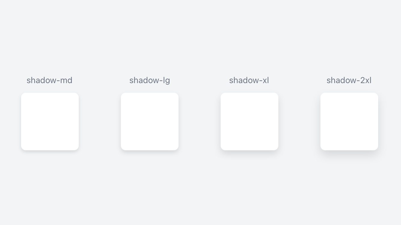
// Property(ies): viewShadowOffset, viewShadowRadius, viewShadowColor - Box Shadow in Tailwind
// Component(s): Ti.UI.View
'.shadow-xs': { viewShadowOffset: { x: 0, y: 0 }, viewShadowRadius: 1, viewShadowColor: '#59000000' }
'.shadow-sm': { viewShadowOffset: { x: 0, y: 1 }, viewShadowRadius: 1, viewShadowColor: '#59000000' }
'.shadow': { viewShadowOffset: { x: 0, y: 2 }, viewShadowRadius: 2, viewShadowColor: '#59000000' }
'.shadow-md': { viewShadowOffset: { x: 0, y: 3 }, viewShadowRadius: 3, viewShadowColor: '#59000000' }
'.shadow-lg': { viewShadowOffset: { x: 0, y: 4 }, viewShadowRadius: 4, viewShadowColor: '#59000000' }
'.shadow-xl': { viewShadowOffset: { x: 0, y: 6 }, viewShadowRadius: 6, viewShadowColor: '#59000000' }
'.shadow-2xl': { viewShadowOffset: { x: 0, y: 8 }, viewShadowRadius: 8, viewShadowColor: '#59000000' }
'.shadow-inner': { viewShadowOffset: { x: 0, y: 0 }, viewShadowRadius: null, viewShadowColor: null }
'.shadow-outline': { viewShadowOffset: { x: 0, y: 0 }, viewShadowRadius: 2, viewShadowColor: '#59000000' }
'.shadow-none': { viewShadowOffset: { x: 0, y: 0 }, viewShadowRadius: null, viewShadowColor: null }

// Property(ies): shadowOffset, shadowRadius, shadowColor - Drop Shadow in Tailwind
// Component(s): Ti.UI.Button, Ti.UI.Label
'.drop-shadow-xs': { shadowOffset: { x: 0, y: 0 }, shadowRadius: 1, shadowColor: '#59000000' }
'.drop-shadow-sm': { shadowOffset: { x: 0, y: 1 }, shadowRadius: 1, shadowColor: '#59000000' }
'.drop-shadow': { shadowOffset: { x: 0, y: 2 }, shadowRadius: 2, shadowColor: '#59000000' }
'.drop-shadow-md': { shadowOffset: { x: 0, y: 3 }, shadowRadius: 3, shadowColor: '#59000000' }
'.drop-shadow-lg': { shadowOffset: { x: 0, y: 4 }, shadowRadius: 4, shadowColor: '#59000000' }
'.drop-shadow-xl': { shadowOffset: { x: 0, y: 6 }, shadowRadius: 6, shadowColor: '#59000000' }
'.drop-shadow-2xl': { shadowOffset: { x: 0, y: 8 }, shadowRadius: 8, shadowColor: '#59000000' }
'.drop-shadow-none': { shadowOffset: { x: 0, y: 0 }, shadowRadius: null, shadowColor: null }
Activity Indicator
New classes for the ActivityIndicator View.
<ActivityIndicator class="indicator-blue-500 activity-indicator-style-big" message="Greetings..." id="activityIndicator" />'.activity-indicator-style-big': { style: Ti.UI.ActivityIndicatorStyle.BIG }
'.indicator-blue-500': { indicatorColor: '#3b82f6' }Indicator Colors Property (ActivityIndicator)
New indicatorColor classes for the animated indicator.
// Property(ies): indicatorColor
// Component(s): Ti.UI.ActivityIndicator
'.indicator-transparent': { indicatorColor: 'transparent' }
'.indicator-black': { indicatorColor: '#000000' }
'.indicator-white': { indicatorColor: '#ffffff' }
'.indicator-slate-50': { indicatorColor: '#f8fafc' }
'.indicator-slate-100': { indicatorColor: '#f1f5f9' }
// ...
And just like any other color property:
- You can also set an arbitrary color value using
hex,rgborrgbacolor values. - You can set them directly in your
xmlfiles or in yourconfig.jsfile. - You can add a color opacity modifier to them.
Styling the activity indicator.
// Property(ies): style
// Component(s): Ti.UI.ActivityIndicator
'.activity-indicator-style-big': { style: Ti.UI.ActivityIndicatorStyle.BIG }
'.activity-indicator-style-dark': { style: Ti.UI.ActivityIndicatorStyle.DARK }
'.activity-indicator-style-big-dark': { style: Ti.UI.ActivityIndicatorStyle.BIG_DARK }
'.activity-indicator-style-plain': { style: Ti.UI.ActivityIndicatorStyle.PLAIN }v3.0.4
What's new in v3.0.4
More properties with arbitrary values
Now you can set arbitrary color values to ALL available color properties, using hex, rgb or rgba color values.
You can set them directly in your xml files or in your config.js file.
<Alloy>
  <Window class="from-(#243c5a) to-(#80243c5a)">
    <Label class="text-center w-11/12 h-16 bg-(rgba(100,200,50,0.5)) text-(rgb(100,200,50))" text="Green Label" />
  </Window>
</Alloy>
// Tailwind styles
'Window': { backgroundColor: '#ffffff' }
'.h-16': { height: 64 }
'.text-center': { textAlign: Ti.UI.TEXT_ALIGNMENT_CENTER }
'.w-11/12': { width: '91.666667%' }
// Styles with arbitrary values
'.bg-(rgba(100,200,50,0.5))': { backgroundColor: 'rgba(100,200,50,0.5)' }
'.from-(#243c5a)': { backgroundGradient: { colors: [ '#00243c5a', '#243c5a' ] } }
'.text-(rgb(100,200,50))': { color: 'rgb(100,200,50)' }
'.to-(#80243c5a)': { backgroundGradient: { colors: [ '#80243c5a' ] } }List of all Color Properties
- Activity Indicator Color
- indicator-(
hex-rgb-or-rgba-value)
- indicator-(
- Active Tint Color
- active-tint-(
hex-rgb-or-rgba-value)
- active-tint-(
- Active Title Color
- active-title-(
hex-rgb-or-rgba-value)
- active-title-(
- Background Color
- bg-(
hex-rgb-or-rgba-value)
- bg-(
- Background Gradient
- from-(
hex-rgb-or-rgba-value) - to-(
hex-rgb-or-rgba-value)
- from-(
- Background Selected Color
- bg-selected-(
hex-rgb-or-rgba-value)
- bg-selected-(
- Bar Color
- bar-(
hex-rgb-or-rgba-value)
- bar-(
- Border Color
- border-(
hex-rgb-or-rgba-value)
- border-(
- Color
- text-(
hex-rgb-or-rgba-value)
- text-(
- Current Page Indicator Color
- current-page-(
hex-rgb-or-rgba-value)
- current-page-(
- Drop Shadow Color
- drop-shadow-(
hex-rgb-or-rgba-value)
- drop-shadow-(
- Hint Text Color
- placeholder-(
hex-rgb-or-rgba-value)
- placeholder-(
- Nav Tint Color
- nav-tint-(
hex-rgb-or-rgba-value)
- nav-tint-(
- Page Indicator Color
- page-(
hex-rgb-or-rgba-value)
- page-(
- Paging Control Color
- paging-(
hex-rgb-or-rgba-value)
- paging-(
- Tabs Background Color
- tabs-bg-(
hex-rgb-or-rgba-value)
- tabs-bg-(
- Tabs Background Selected Color
- tabs-bg-selected-(
hex-rgb-or-rgba-value)
- tabs-bg-selected-(
- Tint Color
- tint-(
hex-rgb-or-rgba-value)
- tint-(
- Title Color
- title-(
hex-rgb-or-rgba-value)
- title-(
- Touch Feedback Color
- feedback-(
hex-rgb-or-rgba-value)
- feedback-(
- View Shadow Color
- shadow-(
hex-rgb-or-rgba-value)
- shadow-(
List of Size or Dimension Properties
- Border Width
- border-(
any-size-value-and-unit)
- border-(
- Content Height
- content-h-(
any-size-value-and-unit)
- content-h-(
- Content Width
- content-w-(
any-size-value-and-unit)
- content-w-(
- Content Width & Content Height
- content-(
any-size-value-and-unit)
- content-(
- Font Size
- text-(
any-size-value-and-unit)
- text-(
- Height
- grid-rows-(
any-size-value-and-unit) - h-(
any-size-value-and-unit)
- grid-rows-(
- Width
- grid-cols-(
any-size-value-and-unit) - w-(
any-size-value-and-unit)
- grid-cols-(
- Top
- mt-(
any-size-value-and-unit) - top-(
any-size-value-and-unit)
- mt-(
- Right
- mr-(
any-size-value-and-unit) - right-(
any-size-value-and-unit)
- mr-(
- Bottom
- bottom-(
any-size-value-and-unit) - mb-(
any-size-value-and-unit)
- bottom-(
- Left
- left-(
any-size-value-and-unit) - ml-(
any-size-value-and-unit)
- left-(
- Top and Bottom
- my-(
any-size-value-and-unit)
- my-(
- Left and Right
- mx-(
any-size-value-and-unit)
- mx-(
- Top, Right, Bottom, Left
- m-(
any-size-value-and-unit)
- m-(
- Padding Top
- pt-(
any-size-value-and-unit)
- pt-(
- Padding Right
- pr-(
any-size-value-and-unit)
- pr-(
- Padding Bottom
- pb-(
any-size-value-and-unit)
- pb-(
- Padding Left
- pl-(
any-size-value-and-unit)
- pl-(
- Padding Top and Bottom
- py-(
any-size-value-and-unit)
- py-(
- Padding Left and Right
- px-(
any-size-value-and-unit)
- px-(
- Padding Top, Right, Bottom and Left
- p-(
any-size-value-and-unit)
- p-(
- PaddingTop, PaddingRight, PaddingBottom, PaddingLeft for Ti.UI.Android.CardView and Ti.UI.TabGroup
- PaddingTop
- padding-t-(
any-size-value-and-unit)
- padding-t-(
- PaddingRight
- padding-r-(
any-size-value-and-unit)
- padding-r-(
- PaddingBottom
- padding-b-(
any-size-value-and-unit)
- padding-b-(
- PaddingLeft
- padding-l-(
any-size-value-and-unit)
- padding-l-(
- PaddingLeft and PaddingRight
- padding-x-(
any-size-value-and-unit)
- padding-x-(
- PaddingTop and PaddingBottom
- padding-y-(
any-size-value-and-unit)
- padding-y-(
- PaddingTop, PaddingRight, PaddingBottom and PaddingLeft
- padding-(
any-size-value-and-unit)
- padding-(
- PaddingTop
Other Properties
- Anchor Point
- origin-(
x-and-y-coordinates)
- origin-(
- Border Radius
- rounded-(
number-value) - rounded-t-(
number-value) - rounded-r-(
number-value) - rounded-b-(
number-value) - rounded-l-(
number-value) - rounded-tl-(
number-value) - rounded-tr-(
number-value) - rounded-br-(
number-value) - rounded-bl-(
number-value)
- rounded-(
- Cache Size
- cache-size-(
number-value)
- cache-size-(
- Delay
- delay-(
number-value)
- delay-(
- Duration
- duration-(
number-value)
- duration-(
- Font Weight
- font-(
valid-font-weight-value)
- font-(
- Max Zoom Scale
- max-scale-(
number-value)
- max-scale-(
- Min Zoom Scale
- min-scale-(
number-value)
- min-scale-(
- Opacity
- opacity-(
number-value)
- opacity-(
- Paging Control Alpha
- paging-(
alpha-value-from-0-to-1)
- paging-(
- Repeat
- repeat-(
number-value)
- repeat-(
- Rotate
- rotate-(
number-value)
- rotate-(
Color opacity modifiers
Now you can add a color opacity modifier to ANY of the available color properties, by adding an opacity-value between 0 and 100 to the end of the color name separated with a slash.
In your XML files
<Label class="w-11/12 h-8 text-center bg-sky-500/50 text-purple-900/75">My Button</Label>// Tailwind styles
'Window': { backgroundColor: '#ffffff' }
'.h-8': { height: 32 }
'.text-center': { textAlign: Ti.UI.TEXT_ALIGNMENT_CENTER }
'.w-11/12': { width: '91.666667%' }
// Styles with color opacity modifiers
'.bg-sky-500/50': { backgroundColor: '#800ea5e9' }
'.text-purple-900/75': { color: '#bf581c87' }In the apply directive
You can also use color opacity modifiers in the apply directive in your config.js file.
module.exports = {
  theme: {
    extend: {
      colors: {
        primary: '#ce10cc'
      }
    },
    '.main-banner': {
      apply: [
        'bg-primary/35',
        'border-primary/75'
      ]
    }
  }
}
// Custom Styles and Resets
'.main-banner': { backgroundColor: '#59ce10cc', borderColor: '#bfce10cc' }
// backgroundColor Property
'.bg-primary': { backgroundColor: '#ce10cc' }List of color properties whose opacity can be adjusted
- Activity Indicator Color
- indicator-{color}/opacity-value
- Active Tint Color
- active-tint-{color}/opacity-value
- Active Title Color
- active-title-{color}/opacity-value
- Background Color
- bg-{color}/opacity-value
- Background Gradient
- from-{color}/opacity-value
- to-{color}/opacity-value
- Background Selected Color
- bg-selected-{color}/opacity-value
- Bar Color
- bar-{color}/opacity-value
- Border Color
- border-{color}/opacity-value
- Color
- text-{color}/opacity-value
- Current Page Indicator Color
- current-page-{color}/opacity-value
- Drop Shadow Color
- drop-shadow-{color}/opacity-value
- Hint Text Color
- placeholder-{color}/opacity-value
- Nav Tint Color
- nav-tint-{color}/opacity-value
- Page Indicator Color
- page-{color}/opacity-value
- Paging Control Color
- paging-{color}/opacity-value
- Tabs Background Color
- tabs-bg-{color}/opacity-value
- Tabs Background Selected Color
- tabs-bg-selected-{color}/opacity-value
- Tint Color
- tint-{color}/opacity-value
- Title Color
- title-{color}/opacity-value
- Touch Feedback Color
- feedback-{color}/opacity-value
- View Shadow Color
- shadow-{color}/opacity-value
v3.0.3
What's new in v3.0.3
Even faster purging time
Up to 2.5 faster than v 2.6.0! On a project with more than 100 XML files, purging time was reduced from 350 ms down to 140 ms.
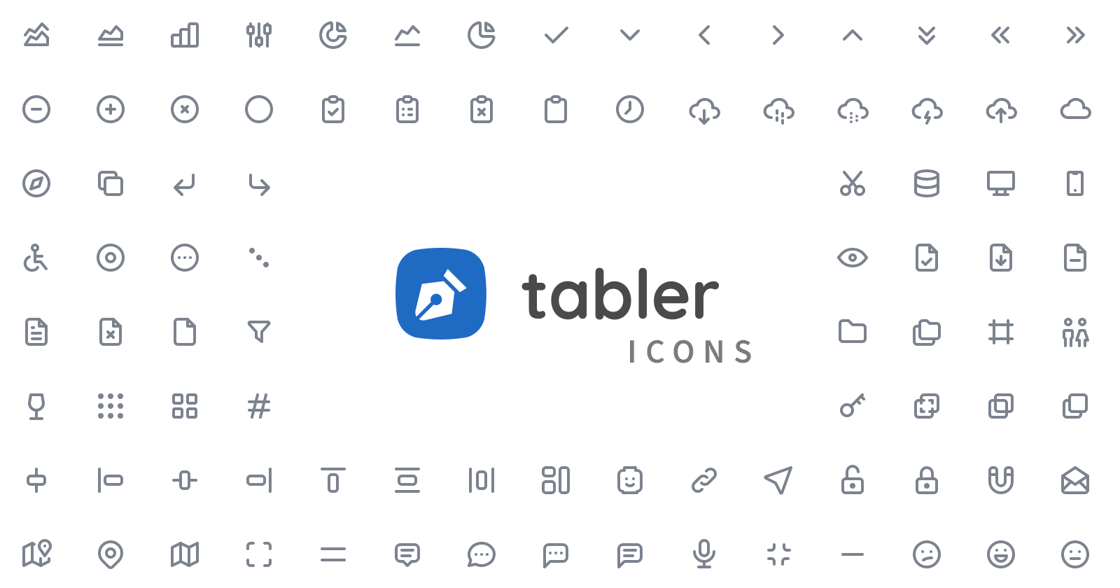
Tabler Icons Font
A set of over 1400 free MIT-licensed high-quality icons for you to use in your projects.
<Button class="text-3xl text-indigo-500 bg-transparent ti ti-device-desktop" />// ...
// Tabler Icons styles
'.ti': { font: { fontFamily: 'tabler-icons' } }
'.ti-device-desktop': { text: '\uea89', title: '\uea89' }
// ...
Shadow Color Property
Continiuing with the new properties from Tailwind CSS v3.0.0, the shadow color property is now available for all Ti components.
Box Shadow Color Property
// Component(s): Ti.UI.View
// Property(ies): viewShadowColor - Box Shadow in Tailwind
'.shadow-transparent': { viewShadowColor: 'transparent' }
'.shadow-black': { viewShadowColor: '#000000' }
'.shadow-white': { viewShadowColor: '#ffffff' }
'.shadow-slate-50': { viewShadowColor: '#f8fafc' }
'.shadow-slate-100': { viewShadowColor: '#f1f5f9' }
// ...
Set the opacity ( from 0 to 100 ) to any shadow color
Now you can add opacity values to any shadow color, by adding a number between 0 and 100 to the end of the color name separated with a slash.
<View class="w-16 h-16 bg-white shadow-lg rounded-2xl shadow-indigo-500/75" />// ...
// Shadow Colors with opacity values
'.shadow-indigo-500/75': { viewShadowColor: '#bf6366f1' }
// ...Set arbitrary values to shadow colors
You can also set arbitrary values to shadow colors, by adding shadow-(hex-rgb-or-rgba-value).
<View class="w-16 h-16 bg-white shadow-lg rounded-2xl shadow-(#ce10cc)" />

<View class="w-16 h-16 bg-white shadow-lg rounded-2xl shadow-(rgba(120,200,250,0.5))" />
// ...
// Styles with arbitrary values
'.shadow-(#ce10cc)': { viewShadowColor: '#ce10cc' }
'.shadow-(rgba(120,200,250,0.5))': { viewShadowColor: 'rgba(120,200,250,0.5' }
// ...v3.0.0
What's new in v3.0.0
PurgeTSS now uses Tailwind CSS v3.0.0
With the release of Tailwind CSS v3.0, PurgeTSS now uses the revamped colors like cyan, rose, fuchsia, and lime. Check out the color palette reference to learn more.
tailwindUI plug-in is no longer required
Because of this, there are some minor breaking changes:
- These colors are no longer available: lightBlue, warmGray, trueGray, coolGray and blueGray. They are replaced with: sky, stone, neutral, gray and slate respectively.
- Two spacing values are removed:
spacing.13andspacing.15, which means styles for Heights, Widths, Margins and Paddings likew-13,h-13,m-15orp-15( and any other variant likemt-13orpx-13) are no longer generated. - You can always extend the
spacingkey in the theme section of yourpurgetss/config.jsfile to add the missing values:
module.exports = {
  theme: {
    extend: {
      spacing: {
        '13': '3.25rem',
        '15': '3.75rem',
      }
    }
  }
}
Future plans
In future updates, we will be adding some of the new styles of TW 3, like Box Shadow Color.
And we will try to match even more Titanium properties.
v2.6.0
What's new in v2.6.0
- What's new in v2.6.0
- Reduced purge time
- Several new properties
Reduced purge time
Up to 4 times faster than before. On a project with more than 100 XML files, purging time was reduced from 1200 ms down to 300 ms.
Several new properties
Tab/TabGroup Properties
titleColor
// Component(s): Ti.UI.Tab, Ti.UI.TabGroup
// Property(ies): titleColor
'.title-transparent': { titleColor: 'transparent' }
'.title-black': { titleColor: '#000000' }
'.title-white': { titleColor: '#ffffff' }
'.title-slate-50': { titleColor: '#f8fafc' }
'.title-slate-100': { titleColor: '#f1f5f9' }
// ...
activeTintColor
// Component(s): Ti.UI.Tab, Ti.UI.TabGroup
// Property(ies): activeTintColor
'.active-tint-transparent': { activeTintColor: 'transparent' }
'.active-tint-black': { activeTintColor: '#000000' }
'.active-tint-white': { activeTintColor: '#ffffff' }
'.active-tint-slate-50': { activeTintColor: '#f8fafc' }
'.active-tint-slate-100': { activeTintColor: '#f1f5f9' }
// ...
activeTitleColor
// Component(s): Ti.UI.Tab, Ti.UI.TabGroup
// Property(ies): activeTitleColor
'.active-title-transparent': { activeTitleColor: 'transparent' }
'.active-title-black': { activeTitleColor: '#000000' }
'.active-title-white': { activeTitleColor: '#ffffff' }
'.active-title-slate-50': { activeTitleColor: '#f8fafc' }
'.active-title-slate-100': { activeTitleColor: '#f1f5f9' }
// ...
tabsBackgroundColor
// Component(s): Ti.UI.TabGroup
// Property(ies): tabsBackgroundColor
'.tabs-bg-transparent': { tabsBackgroundColor: 'transparent' }
'.tabs-bg-black': { tabsBackgroundColor: '#000000' }
'.tabs-bg-white': { tabsBackgroundColor: '#ffffff' }
'.tabs-bg-slate-50': { tabsBackgroundColor: '#f8fafc' }
'.tabs-bg-slate-100': { tabsBackgroundColor: '#f1f5f9' }
// ...
EmailDialog, Toolbar, SearchBar, TabGroup and Window Property
barColor
// Component(s): Ti.UI.EmailDialog, Ti.UI.SearchBar, Ti.UI.TabGroup, Ti.UI.Toolbar, Ti.UI.Window
// Property(ies): barColor
'.bar-transparent': { barColor: 'transparent' }
'.bar-black': { barColor: '#000000' }
'.bar-white': { barColor: '#ffffff' }
'.bar-slate-50': { barColor: '#f8fafc' }
'.bar-slate-100': { barColor: '#f1f5f9' }
// ...
Ti.Media Properties
audioType
// Component(s): Ti.Media.AudioPlayer[android], Ti.Media.Sound[android]
// Property(ies): audioType
'.audio-type-ring[platform=android]': { audioType: Ti.Media.Sound.AUDIO_TYPE_RING }
'.audio-type-alarm[platform=android]': { audioType: Ti.Media.Sound.AUDIO_TYPE_ALARM }
'.audio-type-media[platform=android]': { audioType: Ti.Media.Sound.AUDIO_TYPE_MEDIA }
'.audio-type-voice[platform=android]': { audioType: Ti.Media.Sound.AUDIO_TYPE_VOICE }
'.audio-type-signalling[platform=android]': { audioType: Ti.Media.Sound.AUDIO_TYPE_SIGNALLING }
'.audio-type-notification[platform=android]': { audioType: Ti.Media.Sound.AUDIO_TYPE_NOTIFICATION }
audioSessionCategory
// Component(s): Ti.Media
// Property(ies): audioSessionCategory - iOS Only
'.audio-session-record[platform=ios]': { audioSessionCategory: Ti.Media.AUDIO_SESSION_CATEGORY_RECORD }
'.audio-session-ambient[platform=ios]': { audioSessionCategory: Ti.Media.AUDIO_SESSION_CATEGORY_AMBIENT }
'.audio-session-playback[platform=ios]': { audioSessionCategory: Ti.Media.AUDIO_SESSION_CATEGORY_PLAYBACK }
'.audio-session-solo-ambient[platform=ios]': { audioSessionCategory: Ti.Media.AUDIO_SESSION_CATEGORY_SOLO_AMBIENT }
'.audio-session-play-record[platform=ios]': { audioSessionCategory: Ti.Media.AUDIO_SESSION_CATEGORY_PLAY_AND_RECORD }
SearchBar, TextArea and TextField Property
autocapitalization
// Component(s): Ti.UI.SearchBar, Ti.UI.TextArea, Ti.UI.TextField
// Property(ies): autocapitalization
'.uppercase': { autocapitalization: Ti.UI.TEXT_AUTOCAPITALIZATION_ALL }
'.normal-case': { autocapitalization: Ti.UI.TEXT_AUTOCAPITALIZATION_NONE }
'.capitalize': { autocapitalization: Ti.UI.TEXT_AUTOCAPITALIZATION_WORDS }
'.sentences': { autocapitalization: Ti.UI.TEXT_AUTOCAPITALIZATION_SENTENCES }
AlertDialog, SearchBar, TextArea and TextField Properties
keyboardType
// Component(s): Ti.UI.AlertDialog, Ti.UI.SearchBar, Ti.UI.TextArea, Ti.UI.TextField
// Property(ies): keyboardType
'.keyboard-type': { keyboardType: Ti.UI.KEYBOARD_TYPE_DEFAULT }
'.keyboard-type-ascii': { keyboardType: Ti.UI.KEYBOARD_TYPE_ASCII }
'.keyboard-type-decimal-pad': { keyboardType: Ti.UI.KEYBOARD_TYPE_DECIMAL_PAD }
'.keyboard-type-email': { keyboardType: Ti.UI.KEYBOARD_TYPE_EMAIL }
'.keyboard-type-namephone-pad': { keyboardType: Ti.UI.KEYBOARD_TYPE_NAMEPHONE_PAD }
'.keyboard-type-number-pad': { keyboardType: Ti.UI.KEYBOARD_TYPE_NUMBER_PAD }
'.keyboard-type-numbers-punctuation': { keyboardType: Ti.UI.KEYBOARD_TYPE_NUMBERS_PUNCTUATION }
'.keyboard-type-phone-pad': { keyboardType: Ti.UI.KEYBOARD_TYPE_PHONE_PAD }
'.keyboard-type-url': { keyboardType: Ti.UI.KEYBOARD_TYPE_URL }
'.keyboard-type-appearance[platform=ios]': { keyboardType: Ti.UI.KEYBOARD_APPEARANCE_DEFAULT }
'.keyboard-type-appearance-dark[platform=ios]': { keyboardType: Ti.UI.KEYBOARD_APPEARANCE_DARK }
'.keyboard-type-appearance-light[platform=ios]': { keyboardType: Ti.UI.KEYBOARD_APPEARANCE_LIGHT }
'.keyboard-type-twitter[platform=ios]': { keyboardType: Ti.UI.KEYBOARD_TYPE_TWITTER }
'.keyboard-type-websearch[platform=ios]': { keyboardType: Ti.UI.KEYBOARD_TYPE_WEBSEARCH }
keyboardAppearance
// Component(s): Ti.UI.AlertDialog, Ti.UI.SearchBar, Ti.UI.TextArea, Ti.UI.TextField
// Property(ies): keyboardAppearance - iOS Only
'.keyboard-appearance[platform=ios]': { keyboardAppearance: Ti.UI.KEYBOARD_APPEARANCE_DEFAULT }
'.keyboard-appearance-dark[platform=ios]': { keyboardAppearance: Ti.UI.KEYBOARD_APPEARANCE_DARK }
'.keyboard-appearance-light[platform=ios]': { keyboardAppearance: Ti.UI.KEYBOARD_APPEARANCE_LIGHT }
VideoPlayer and ImageView Property
scalingMode
// Property(ies): scalingMode
// Description: Background Size for compatibility with Tailwind classes
'.bg-auto': { scalingMode: Ti.Media.IMAGE_SCALING_NONE }
'.bg-cover': { scalingMode: Ti.Media.IMAGE_SCALING_ASPECT_FILL }
'.bg-contain': { scalingMode: Ti.Media.IMAGE_SCALING_ASPECT_FIT }

// Component(s): Ti.UI.ImageView
// Property(ies): scalingMode
// Description: Image Scaling Mode
'.image-scaling-auto': { scalingMode: Ti.Media.IMAGE_SCALING_AUTO }
'.image-scaling-none': { scalingMode: Ti.Media.IMAGE_SCALING_NONE }
'.image-scaling-fill': { scalingMode: Ti.Media.IMAGE_SCALING_FILL }
'.image-scaling-cover': { scalingMode: Ti.Media.IMAGE_SCALING_ASPECT_FILL }
'.image-scaling-contain': { scalingMode: Ti.Media.IMAGE_SCALING_ASPECT_FIT }

// Component(s): Ti.Media.VideoPlayer
// Property(ies): scalingMode
// Description: Video Scaling Mode
'.video-scaling-resize': { scalingMode: Ti.Media.VIDEO_SCALING_RESIZE }
'.video-scaling-contain': { scalingMode: Ti.Media.VIDEO_SCALING_RESIZE_ASPECT }
'.video-scaling-cover': { scalingMode: Ti.Media.VIDEO_SCALING_RESIZE_ASPECT_FILL }
SearchBar Property
showCancel
// Component(s): Ti.UI.SearchBar
// Property(ies): showCancel
'.show-cancel': { showCancel: true }
'.hide-cancel': { showCancel: false }