Releases: macCesar/purgeTSS
v2.5.8
What's new in v2.5.8
Fixed: zIndex values in complex Views.
When dealing with an array of complex Views ( a View with children ), the zIndex sorting was working incorrectly.
Now it takes the zIndex of the based View and not the dragged ( or selected ) child.
bounds: prefix ( or modifier )
Now you can set boundaries in which the View can move within its parent View.
You can set global boundaries and/or local boundaries to each individual view. Local values will overwrite any global values.
Example 1
The card view has a boundary of m-4 and a bottom boundary of mb-16.
index.xml
<Alloy>
  <Window class="keep-screen-on dont-exit-on-close bg-green-50">
    <View class="w-screen h-screen mx-6 mt-10 mb-6 bg-green-200 rounded-lg">
      <View id="card" class="w-64 h-24 mt-8 shadow-lg bounds:m-2 bounds:mb-16">
        <View id="cardInside" class="w-screen bg-white border-2 border-purple-700 rounded-lg ">
          <ImageView id="theImage" class="w-16 h-16 m-4 ml-4 rounded-16 prevent-default-image bg-gray-50" image="https://randomuser.me/api/portraits/women/17.jpg" />

          <View class="w-screen ml-24 vertical">
            <Label class="ml-0 text-sm font-bold text-gray-800" text="Someone Famous" />
            <Label class="ml-0 text-xs font-bold text-gray-400" text="Website Designer" />
          </View>
        </View>
      </View>

      <Label class="mx-2 mb-2 h-12 rounded-lg text-white text-center w-screen bg-(#80000000)" text="Some Element..." />
    </View>

    <Animation id="draggableAnimation" module="purgetss.ui" />
  </Window>
</Alloy>
index.js
$.index.open();

$.draggableAnimation.draggable($.card);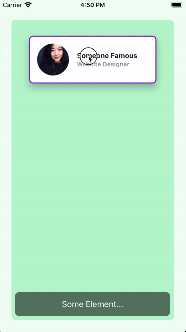
* low framerate gif
Example 2
In this example, the boundaries are set globally in the draggableAnimation view.
Every card view will use the global values.
index.xml
<Alloy>
  <Window class="keep-screen-on dont-exit-on-close bg-green-50">
    <View class="w-screen h-screen mx-6 mt-10 mb-6 bg-green-200 rounded-lg">
      <View id="card" class="w-64 h-24 mt-8 shadow-lg">
        <View id="cardInside" class="w-screen bg-white border-2 border-purple-700 rounded-lg ">
          <ImageView id="theImage" class="w-16 h-16 m-4 ml-4 rounded-16 prevent-default-image bg-gray-50" image="https://randomuser.me/api/portraits/women/17.jpg" />

          <View class="w-screen ml-24 vertical">
            <Label class="ml-0 text-sm font-bold text-gray-800" text="Someone Famous" />
            <Label class="ml-0 text-xs font-bold text-gray-400" text="Website Designer" />
          </View>
        </View>
      </View>

      <View id="card2" class="w-64 h-24 mt-40 shadow-lg">
        <View id="cardInside" class="w-screen bg-white border-2 border-purple-700 rounded-lg ">
          <ImageView id="theImage" class="w-16 h-16 m-4 ml-4 rounded-16 prevent-default-image bg-gray-50" image="https://randomuser.me/api/portraits/women/21.jpg" />

          <View class="w-screen ml-24 vertical">
            <Label class="ml-0 text-sm font-bold text-gray-800" text="Second Famous" />
            <Label class="ml-0 text-xs font-bold text-gray-400" text="Website Designer" />
          </View>
        </View>
      </View>

      <View id="card3" class="w-64 h-24 shadow-lg mt-72">
        <View id="cardInside" class="w-screen bg-white border-2 border-purple-700 rounded-lg ">
          <ImageView id="theImage" class="w-16 h-16 m-4 ml-4 rounded-16 prevent-default-image bg-gray-50" image="https://randomuser.me/api/portraits/women/25.jpg" />

          <View class="w-screen ml-24 vertical">
            <Label class="ml-0 text-sm font-bold text-gray-800" text="Third Famous" />
            <Label class="ml-0 text-xs font-bold text-gray-400" text="Website Designer" />
          </View>
        </View>
      </View>

      <Label class="mx-2 mb-2 h-12 rounded-lg text-white text-center w-screen bg-(#80000000)" text="Some Element..." />
    </View>

    <Animation id="draggableAnimation" module="purgetss.ui" class="bounds:m-2 bounds:mb-16" />
  </Window>
</Alloy>
index.js
$.index.open();

$.draggableAnimation.draggable([$.card, $.card2, $.card3]);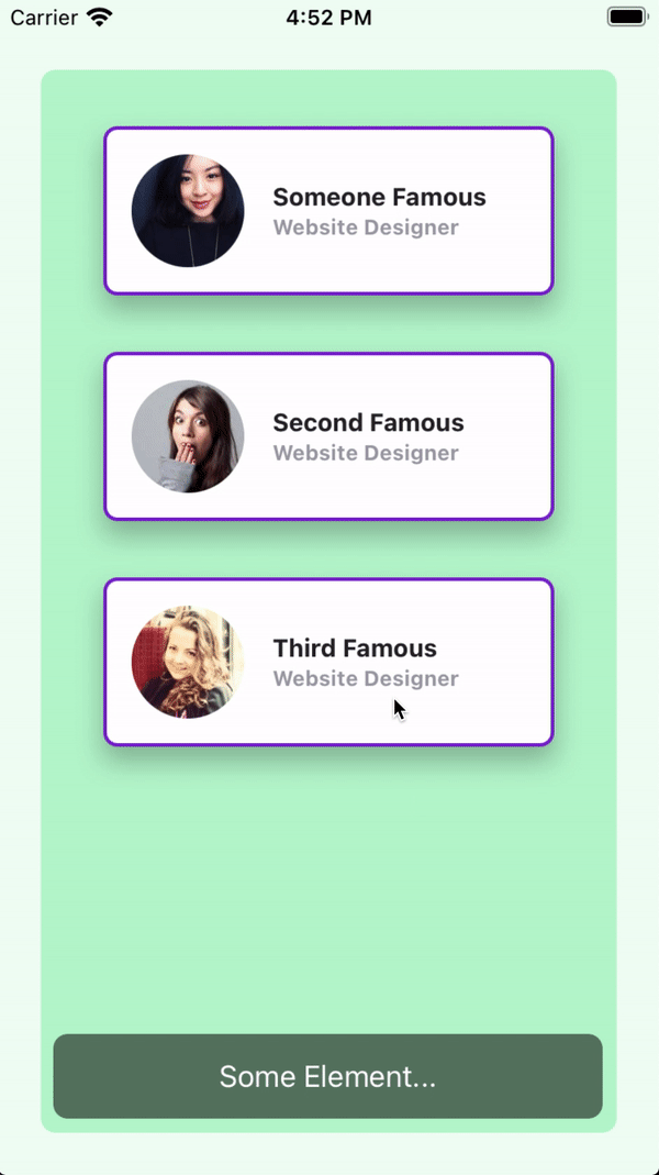
* low framerate gif
v2.5.5
What's new in v2.5.5
Extra scale values
Added some extra values for the scale property
// Component(s): Ti.UI.ScrollView
// Property(ies): scale
'.scale-0': { scale: '0' }
'.scale-5': { scale: '.05' }
'.scale-10': { scale: '.10' }
'.scale-25': { scale: '.25' }
'.scale-50': { scale: '.5' }
'.scale-75': { scale: '.75' }
'.scale-90': { scale: '.9' }
'.scale-95': { scale: '.95' }
'.scale-100': { scale: '1' }
'.scale-105': { scale: '1.05' }
'.scale-110': { scale: '1.1' }
'.scale-125': { scale: '1.25' }
'.scale-150': { scale: '1.5' }
New draggable method, modifiers and properties in the Animation module
- Now you can convert any View or a set of Views into draggable elements by using the new
draggablemethod. - You can set basic animations when dragging or dropping elements with the modifiers
drag:anddrop:. - You can apply or animate the animations either globally or locally with the
draggingTypeproperty. - You can constraint any View to horizontal or vertical movement with the
constraintproperty.
To install purgetss.ui module in your project, run:
> purgetss moduleIt will install purgetss.ui inside your lib folder.
For more information and available methods, modifiers and properties, see Animation Module
The draggable method
$.draggableAnimation.draggable([$.red, $.green, $.blue]);You can use any Animation element created in your view to use the draggable method, but by using one Animation on a set of Views, it will handle the zIndex of every draggable element automatically.
<Alloy>
  <Window class="keep-screen-on dont-exit-on-close">
    <View id="red" class="w-32 h-32 ml-4 bg-red-500 rounded-lg" />

    <View id="green" class="w-32 h-32 ml-10 bg-green-500 rounded-lg" />

    <View id="blue" class="w-32 h-32 ml-16 bg-blue-500 rounded-lg" />

    <Animation id="draggableAnimation" module="purgetss.ui" />
  </Window>
</Alloy>$.index.open();
$.draggableAnimation.draggable([$.red, $.green, $.blue]);
* low framerate gif
drag: and drop: prefixes ( modifiers )
You can set basic animations while dragging and dropping elements.
You can create an Animation element with a “global” set of modifiers or you can set modifiers separately to each view.
Local modifiers will overwrite any global modifier.
To simplify things... We are restricting the type of animations that can be apply while dragging ( or dropping ). Mainly we are not applying any size, scale or anchorPoint transformation.
<Alloy>
  <Window class="keep-screen-on dont-exit-on-close">
    <!-- No local modifiers, will be using the global modifiers -->
    <View id="red" class="w-32 h-32 ml-4 bg-red-500 rounded-lg" />

    <!-- Local modifiers: drag:bg-green-700 drop:bg-green-500 plus the global modifiers-->
    <View id="green" class="w-32 h-32 ml-10 bg-green-500 rounded-lg drag:bg-green-700 drop:bg-green-500" />

    <!-- Local modifiers: overwriting the global opacity to drag:opacity-80 -->
    <View id="blue" class="w-32 h-32 ml-16 bg-blue-500 rounded-lg drag:opacity-80" />

    <!-- Global set of modifiers -->
    <Animation id="draggableAnimation" module="purgetss.ui" class="drag:duration-100 drag:opacity-50 drop:opacity-100" />
  </Window>
</Alloy>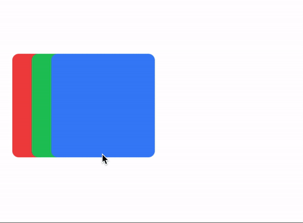
* low framerate gif
draggingType property
For controlling how drag: and drop: modifiers are applied, either by animating: drag-animate ( default ) or by applying: drag-apply the properties.
// Component(s): For the Animation Component
// Property(ies): draggingType
'.drag-apply': { draggingType: 'apply' }
'.drag-animate': { draggingType: 'animate' }
In the following example, the Animation element is setting the global dragging type to drag-apply, but the green square is overwriting it to drag-animate.
<Alloy>
  <Window class="keep-screen-on dont-exit-on-close">
    <!-- No local modifiers, will be using the global modifiers -->
    <View id="red" class="w-32 h-32 ml-4 bg-red-500 rounded-lg" />

    <!-- Local modifiers: drag:bg-green-700 drop:bg-green-500 plus the global modifiers-->
    <View id="green" class="w-32 h-32 ml-10 bg-green-500 rounded-lg drag-animate drag:bg-green-700 drop:bg-green-500" />

    <!-- Local modifiers: overwriting the global opacity to drag:opacity-80 -->
    <View id="blue" class="w-32 h-32 ml-16 bg-blue-500 rounded-lg drag:opacity-80" />

    <!-- Global set of modifiers -->
    <Animation id="draggableAnimation" module="purgetss.ui" class="drag-apply drag:duration-500 drag:opacity-50 drop:opacity-100" />
  </Window>
</Alloy>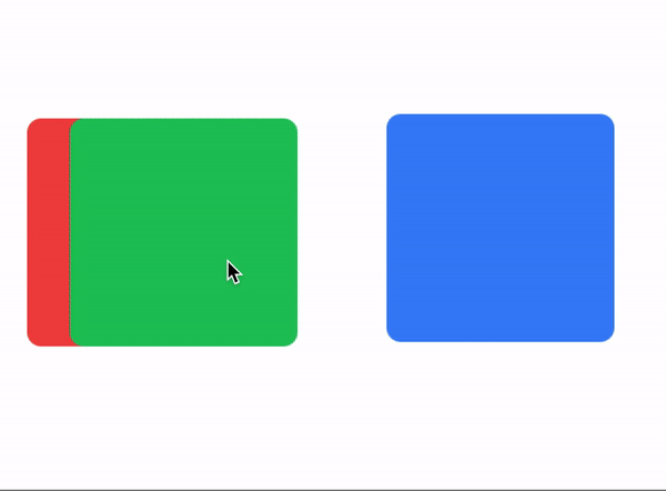
* low framerate gif
vertical and horizontal constraints
Add a vertical and horizontal constraint to any dragging element.
// Component(s): Ti.UI.Animation
// Property(ies): A custom property to use it with the Animation module
'.horizontal-constraint': { constraint: 'horizontal' }
'.vertical-constraint': { constraint: 'vertical' }
In this example the card will move only from side to side.
<Alloy>
  <Window class="keep-screen-on dont-exit-on-close">
    <View id="card" class="w-64 h-24 shadow-lg horizontal-constraint">
      <View id="cardInside" class="w-screen bg-white border-2 border-purple-700 rounded-lg">
        <ImageView id="theImage" class="w-16 h-16 m-4 ml-4 rounded-16" image="https://randomuser.me/api/portraits/women/17.jpg" />

        <View class="w-screen ml-24 vertical">
          <Label class="ml-0 text-sm font-bold text-gray-800" text="Someone Famous" />
          <Label class="ml-0 text-xs font-bold text-gray-400" text="Website Designer" />
        </View>
      </View>
    </View>

    <Animation id="draggableAnimation" module="purgetss.ui" />
  </Window>
</Alloy>$.index.open();
$.draggableAnimation.draggable($.card);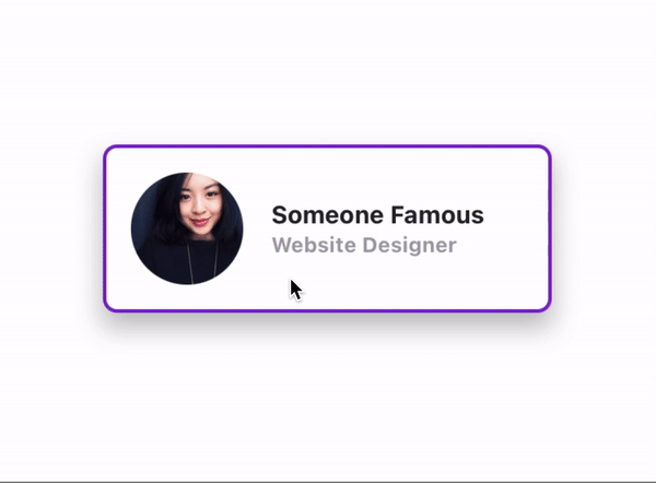
* low framerate gif
v2.5.3
What's new in v2.5.3
zIndex utilities
Utilities for controlling the stack order of an element.
// Component(s): Ti.UI.Animation, Ti.UI.View
// Property(ies): zIndex
'.z-0': { zIndex: 0 }
'.z-10': { zIndex: 10 }
'.z-20': { zIndex: 20 }
'.z-30': { zIndex: 30 }
'.z-40': { zIndex: 40 }
'.z-50': { zIndex: 50 }
Boxicons Font v2.0.9!
Added a beatufil library of icons called Boxicons.
A High Quality web friendly icons
'Boxicons' is a carefully designed open source iconset with 1500+ icons. It's crafted to look enrich your website/app experience.
To copy the new font file to your project use:
> purgetss fonts --vendor="boxicons"

# alias:
> purgetss f -v=bx
Add the --modules flag to also copy the corresponding CommonJS module into ./app/lib/ folder:
> purgetss fonts --vendor="boxicons" --modules

# alias:
> purgetss f -v=bx -m
We are keeping the prefixes of boxicons classes in the boxicons.js file to prevent unexpected results, because there are three sets of icons in the same font file: Logos, Regular and Solid.
- Regular:
bx-flagbecomesbxFlag - Solid:
bxs-flagbecomesbxsFlag - Logos: Almost all the logos have no conflict with other classes, because almost all have unique names, except for one:
bxl-windowsandbx-windows. That's why we are also keeping the prefix for alllogosvariants, so they become:bxlWindowsfor example.
We are still experimenting with the recently added create command
We temporary remove a second error check in order to continue with the creation and installation process.
We've also added the --vendor argument to specify which icon font you'd like to install.
> purgetss create 'Name of the Project' [--vendor="fontawesome, materialdesign, lineicons, boxicons"]

# alias:
> purgetss c 'Name of the Project' [-v=fa,md,li,bx]
Please check the complete instructions here
Set rotate, scale and anchorPoints in open: and close: states
Now you can set rotate, scale and anchorPoints separately when opening or closing states.
<Alloy>
  <Window class="bg-purple-700 keep-screen-on">
    <Button id="chevron" class="w-16 h-16 text-3xl text-purple-700 bg-white rounded-16 fas fa-chevron-right" ios:onSingletap="doRotate" android:onClick="doRotate" />
    <Animation id="myRotation" class="open:rotate-90 close:-rotate-90" module="purgetss.ui" />
  </Window>
</Alloy>$.index.open();
$.myRotation.play($.chevron);
function doRotate() {
$.myRotation.play($.chevron);
}A more complex UI with animations
<Alloy>
  <Window class="bg-purple-700 keep-screen-on dont-exit-on-close">
    <View id="navBar" class="w-24 ml-2 h-6/12">
      <View class="grid-flow-row mr-8 bg-white rounded-lg shadow-lg" ios:onSingletap="doAction" android:onClick="doAction">
        <View class="ml-0 grid-rows-7 w-72 ">
          <View class="items-center horizontal bg-selected-purple-100" action="home">
            <Button class="w-16 h-full ml-0 text-xl text-purple-700 bg-transparent border-transparent touch-disabled fas fa-home" />
            <Label class="text-purple-700 touch-disabled" text="Home" />
          </View>
        </View>

        <View class="ml-0 grid-rows-7 w-72">
          <View class="items-center horizontal bg-selected-purple-100" action="profile">
            <Button class="w-16 h-full ml-0 text-xl text-purple-700 bg-transparent border-transparent touch-disabled fas fa-user" />
            <Label class="text-purple-700 touch-disabled" text="Profile" />
          </View>
        </View>

        <View class="ml-0 grid-rows-7 w-72">
          <View class="items-center horizontal bg-selected-purple-100" action="messages">
            <Button class="w-16 h-full ml-0 text-xl text-purple-700 bg-transparent border-transparent touch-disabled fas fa-comment" />
            <Label class="text-purple-700 touch-disabled" text="Messages" />
          </View>
        </View>

        <View class="ml-0 grid-rows-7 w-72">
          <View class="items-center horizontal bg-selected-purple-100" action="help">
            <Button class="w-16 h-full ml-0 text-xl text-purple-700 bg-transparent border-transparent touch-disabled fas fa-question-circle" />
            <Label class="text-purple-700 touch-disabled" text="Help" />
          </View>
        </View>

        <View class="ml-0 grid-rows-7 w-72">
          <View class="items-center horizontal bg-selected-purple-100" action="settings">
            <Button class="w-16 h-full ml-0 text-xl text-purple-700 bg-transparent border-transparent touch-disabled fas fa-cog" />
            <Label class="text-purple-700 touch-disabled" text="Settings" />
          </View>
        </View>

        <View class="ml-0 grid-rows-7 w-72">
          <View class="items-center horizontal bg-selected-purple-100" action="password">
            <Button class="w-16 h-full ml-0 text-xl text-purple-700 bg-transparent border-transparent touch-disabled fas fa-lock" />
            <Label class="text-purple-700 touch-disabled" text="Password" />
          </View>
        </View>

        <View class="ml-0 grid-rows-7 w-72">
          <View class="items-center horizontal bg-selected-purple-100" action="sign-out">
            <Button class="w-16 h-full ml-0 text-xl text-purple-700 bg-transparent border-transparent touch-disabled fas fa-sign-out-alt" />
            <Label class="text-purple-700 touch-disabled" text="Sign Out" />
          </View>
        </View>
      </View>

      <Button id="chevy" class="w-10 h-10 text-xl text-purple-700 bg-white border-4 border-purple-700 fas rounded-10 fa-chevron-up mr-1.5" zIndex="2000" ios:onSingletap="doAnimation" android:onClick="doAnimation" />

      <Animation id="myAnimation" module="purgetss.ui" class="duration-150 open:w-72 close:w-24" />
      <Animation id="myAnimationChevron" module="purgetss.ui" class="duration-150 rotate-90 open:rotate-90 close:-rotate-90" />
    </View>

    <View id="myCard" class="w-8/12 h-24 mt-6 mr-6 shadow-lg">
      <View class="bg-white rounded-lg vertical">
        <View ios:onSingletap="myCardClicked" android:onClick="myCardClicked">
          <ImageView class="w-16 h-16 m-4 ml-4 rounded-16" image="https://randomuser.me/api/portraits/women/17.jpg" />

          <View class="ml-24 vertical">
            <Label class="text-sm font-bold text-gray-800" text="Someone Famous" />
            <Label class="text-xs font-bold text-gray-400" text="Website Designer" />
          </View>
        </View>

        <View class="w-screen mx-2 bg-gray-300 rounded-1 h-0.5" />

        <View class="h-48 grid-flow-row mt-2" ios:onSingletap="doAction" android:onClick="doAction">
          <View class="grid-rows-5 ml-0 w-72">
            <View class="items-center horizontal bg-selected-purple-100" action="profile">
              <Button class="h-full ml-0 text-xl text-purple-700 bg-transparent border-transparent touch-disabled w-14 fas fa-user" />
              <Label class="text-sm text-purple-700 touch-disabled" text="Edit Profile" />
            </View>
          </View>

          <View class="grid-rows-5 ml-0 w-72">
            <View class="items-center horizontal bg-selected-purple-100" action="inbox">
              <Button class="h-full ml-0 text-xl text-purple-700 bg-transparent border-transparent touch-disabled w-14 fas fa-inbox" />
              <Label class="text-sm text-purple-700 touch-disabled" text="Inbox" />
            </View>
          </View>

          <View class="grid-rows-5 ml-0 w-72">
            <View class="items-center horizontal bg-selected-purple-100" action="settings">
              <Button class="h-full ml-0 text-xl text-purple-700 bg-transparent border-transparent touch-disabled w-14 fas fa-cog" />
              <Label class="text-sm text-purple-700 touch-disabled" text="Settings" />
            </View>
          </View>

          <View class="grid-rows-5 ml-0 w-72">
            <View class="items-center horizontal bg-selected-purple-100" action="support">
              <Button class="h-full ml-0 text-xl text-purple-700 bg-transparent border-transparent touch-disabled w-14 fas fa-question-circle" />
              <Label class="text-sm text-purple-700 touch-disabled" text="Support" />
            </View>
          </View>

          <View class="grid-rows-5 ml-0 w-72">
            <View class="items-center horizontal bg-selected-purple-100" action="sign-out">
              <Button class="h-full ml-0 text-xl text-purple-700 bg-transparent border-transparent touch-disabled w-14 fas fa-sign-out-alt" />
              <Label class="text-sm text-purple-700 touch-disabled" text="Sign Out" />
            </View>
          </View>
        </View>
      </View>

      <View class="w-8 h-8 mb-0 mr-0 bg-blue-400">
        <Button id="myCardChevron" class="text-white bg-transparent border-transparent fas fa-chevron-right" ios:onSingletap="myCardClicked" android:onClick="myCardClicked" />
      </View>

      <Animation id="myCardAnimation" module="purgetss.ui" class="duration-150 open:h-(298) close:h-24" />
      <Animation id="myCardAnimationChevron" module="purgetss.ui" class="duration-150 rotate-90 open:rotate-90 close:-rotate-90" />
    </View>

<Label id="action" class="mx-2 mb-2 text-sm f...v2.5.0
What's new in v2.5.0
- What's new in v2.5.0
Breaking changes & new utilities
- As of Tailwind CSS v2.2,
lightBluehas been renamed tosky. - Changed
bg-gradient-to-{direction}tobg-linear-to-{direction} - Added
touch-enabledandtouch-disabledutilities (touchEnabled) - Added
platform-w,platform-hutilities (Ti.Platform.displayCaps width and height) - Reduced purging time by 56% ( on average )
- iOS Only
- Added
bg-radial-to-{direction}utilities - Added
prevent-default-imageanddisplay-default-imageutilities (preventDefaultImage)
- Added
- Android Only
exit-on-closeanddont-exit-on-closeutilities (exitOnClose)keep-screen-onandkeep-screen-offutilities (keepScreenOn)scroll-horizontalandscroll-verticalutilities (scrollType)
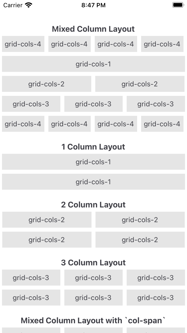
Grid System
A simple but useful Grid System with utilities to lay columns and rows.
This is the most basic layout in order to use the grid system. Of course you can create a more complex layout by mixing different columns and rows.
<Alloy>
  <View class='grid'>
    <View class="grid-cols-4">
      <View class="gap-1"> <!-- Optional if you dont need a gutter between columns ( or rows ) -->
        <!-- ANY CONTENT GOES HERE -->
      </View>
    </View>

    <View class="grid-cols-4">
      <View class="gap-1"> <!-- Optional if you dont need a gutter between columns ( or rows ) -->
        <!-- ANY CONTENT GOES HERE -->
      </View>
    </View>
    ...
    ...
    ...
  </View>
</Alloy>
Column grid
.grid-cols-{n}
With grid-cols your are telling the grid system how many columns you want to fit in each row, for example if you set each view with a .grid-cols-2 class it will fit two views per row, .grid-cols-3 will fit three views, and so on.
.col-span-{n}
With col-span you are setting the number of columns each element will occupy in a 12 column grid.
If you set a view with .col-span-3 you can add three more views of equal width to fill the row, or any other combination like 3-6-3, 2-4-6, etc., as long as the sum fills a 12 column grid.
Row grid
.grid-rows-{n}
With grid-rows your are telling the grid system how many rows you want to fit in each column, for example if you set each view with a .grid-rows-2 class it will fit two views per row, .grid-rows-3 will fit three views, and so on.
.row-span-{n}
With row-span you are setting the number of rows each element will occupy in a 12 row grid.
If you set a view with .row-span-3 you can add three more views of equal height to fill the column, or any other combination like 3-6-3, 2-4-6, etc., as long as the sum fills a 12 row grid.
Available utilities for The Grid
These are the available utilities to control ”The Grid”
Gap
Utilities for controlling gutters between grid.
- Use
gap-{size}to change the gap between both rows and columns. - Use
gap-x-{size}andgap-y-{size}to change the gap between rows and columns independently. - use
gap-{side}-{size}to change the gap between rows and columns to an specific side. t=top, r=right, b=bottom and l=left.
Column Span
Utilities for controlling how elements are sized across grid columns.
- Use the
col-span-{n}utilities to make an element span n columns.
Row Span
Utilities for controlling how elements are sized across grid rows.
- Use the row-span-{n} utilities to make an element span n rows.
Grid and Grid Flow
Utilities for controlling the direction of the grid system.
- Use
gridorgrid-flow-colto set thelayoutpoperty tohorizontal. - Use
grid-flow-rowto set thelayoutpoperty tovertical.
Grid Template Columns
Utilities for specifying the columns in a grid layout.
- Use the
grid-cols-{n}utilities to create grids with n equally sized columns.
Grid Template Rows
Utilities for specifying the rows in a grid layout.
- Use the
grid-rows-{n}utilities to create grids with n equally sized rows.
Items
Utilities for controlling how elements are sized and placed across grid rows.
start,endandcenterutilities
Animation Module
Animation is a Titanium module to apply a 2D Matrix animation or transformation to any element or to an array of elements.
- You can create as many
Animationelements as you want on each View file. - You can chain them with callback functions to create a sequence of animations.
- You can
playthe animation to a single element or an array of elements, like the children of a view for example. - You can
applythe properties instantly without animation. - You can set:
delay,duration,rotation,scaling,repetition,animation curve. - You can animate properties like background color, opacity, width, height and more.
- You can set different properties to different states, using the prefix
open:,close:andcomplete:.
Instalation
Use the new purgetss module command to install the module in your lib folder.
> purgetss module

# alias:
> purgetss m
Usage
To use it, create an Animation element that will hold the transformation values. And set its 'module' property to module='purgetss.ui'
You can set any of the sizing, positioning and color properties available in tailwind.tss.
Available methods
There are two methods available play and apply.
play
Use the play method in your controller to reproduce the animation by passing the element that you want to animate.
You can call the method when opening the controller, after a click event, etc.
$.myAnimation.play($.myView);apply
Use apply when you need to immediately apply the properties and transformations to the view.
$.myAnimation.apply($.myView);Example 1
<Alloy>
  <Window>
    <View id="square" class="w-16 h-16 bg-blue-500" />
    <Animation module="purgetss.ui" id="myAnimation" class="w-32 h-32 bg-green-500" />
  </Window>
</Alloy>
In the controller pass the element that you want to animate.
$.index.open();
$.myAnimation.play($.square);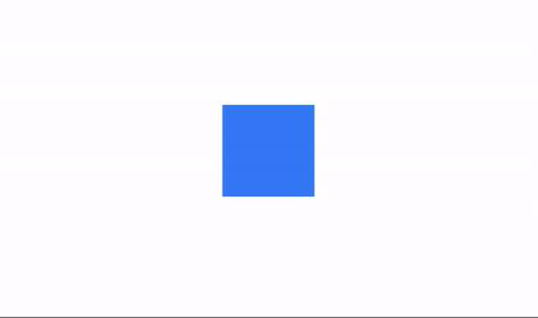
* low framerate gif
Example 2
You can create more complex animations by combining properties to different states like when opening or closing an animation.
<Alloy>
  <Window class="keep-screen-on">
    <View class="vertical">
      <Button class="w-48 mt-1 bg-purple-500 rounded ios:mt-16 text-purple-50" ios:onSingletap="do3Squares" android:onClick="do3Squares" title="3 Squares"/>
      <Button class="w-48 mt-2 bg-purple-500 rounded text-purple-50" ios:onSingletap="doChangeColors" android:onClick="doChangeColors" title="Toggle Colors"/>
      <Button class="w-48 mt-2 bg-purple-500 rounded text-purple-50" ios:onSingletap="doRetweet" android:onClick="doRetweet" title="Toggle Re-Tweet"/>

      <View id="squares" class="w-screen mt-10 vertical">
        <View id="aquare1" class="bg-blue-700 w-28 h-28 rounded-xl" />
        <View id="aquare2" class="mt-4 bg-blue-700 w-28 h-28 rounded-xl" />
        <View id="aquare3" class="mt-4 bg-blue-700 w-28 h-28 rounded-xl" />
      </View>
    </View>

    <View id="square3" class="mt-8 bg-blue-500 w-14 h-14 rounded-xl" ios:onSingletap="doTransparency" android:onClick="doTran...